ARCADE FOOD THEATRE
Arcade is a passionate, yet playful dive into a sensory-driven and versatile food market experience, bringing together a diverse collection of innovative restaurant brands from across London.
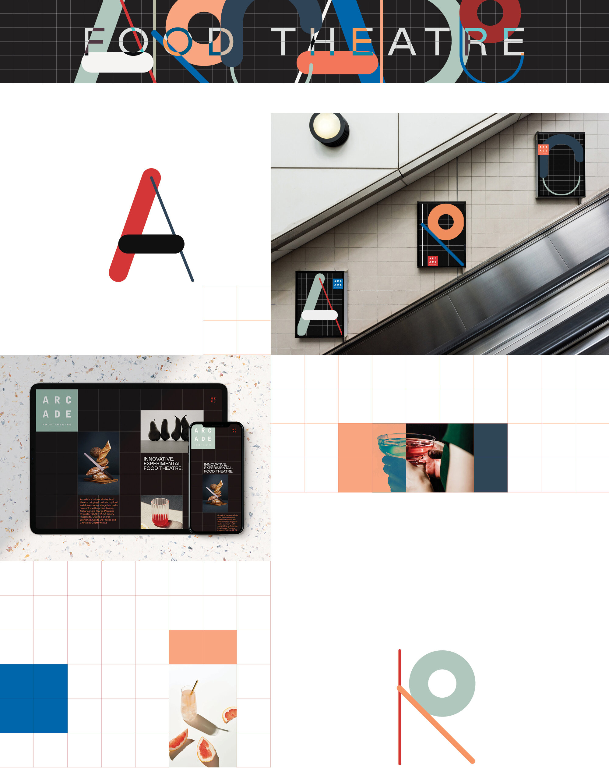
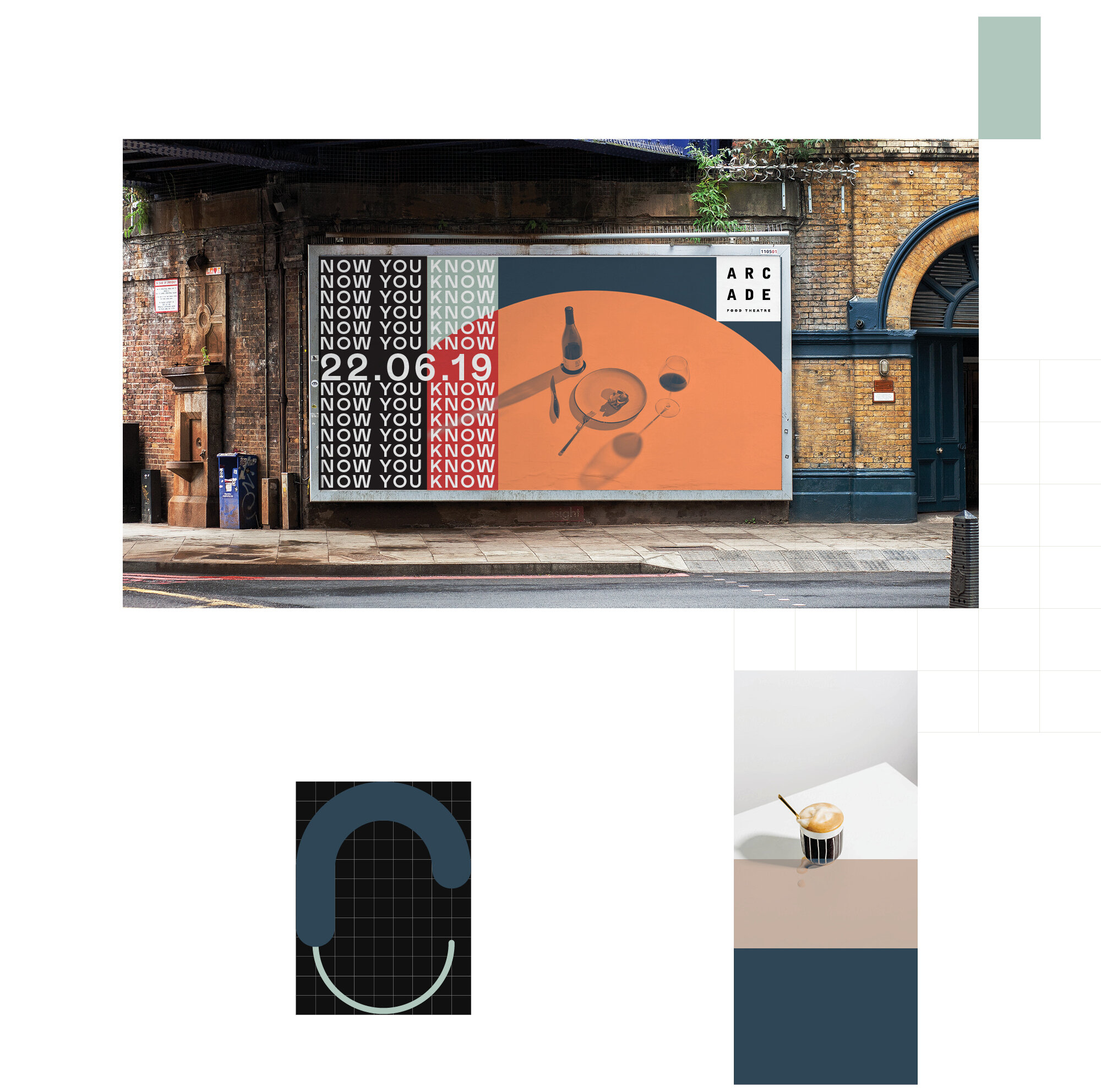
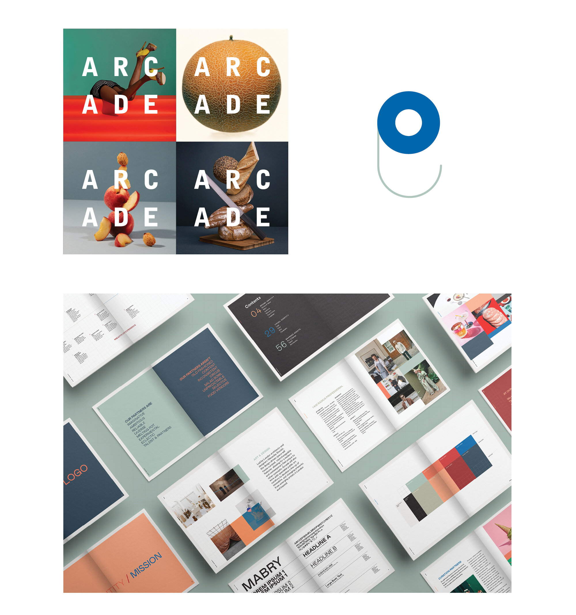
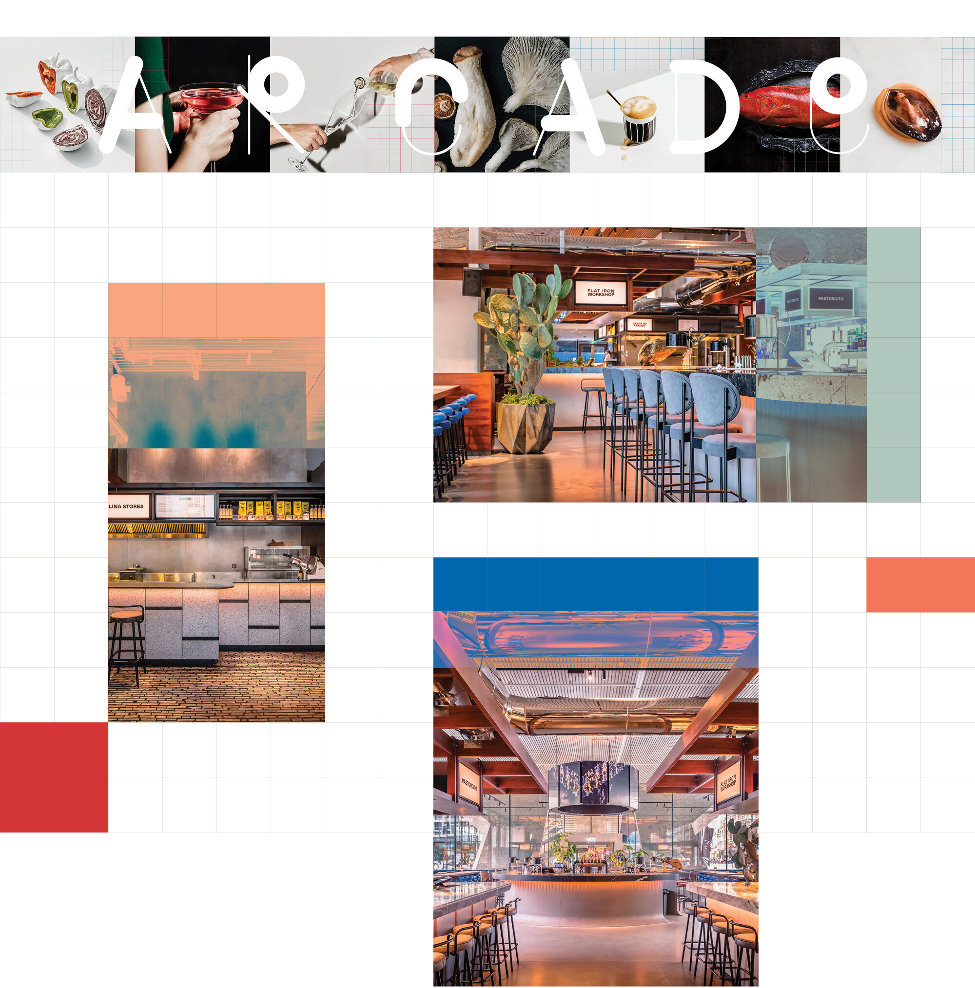
We developed the brand strategy and visual identity for Arcade, from the tone of voice and signage to the word “Arcade” itself, every element of the market’s physical space and digital footprint were carefully considered. Arcade’s entire library of colours, shapes and textures is a nod to the lively world of experiences and flavours one may find in this food theatre.


While the logo itself is quite simple, the uniqueness of the brand comes from the square grid system it was designed on. Disrupting the grid by utilizing colour blocking and tonal overlays, we amplified the playful aspects of the brand’s identity. The word “ARCADE” was designed in a more abstract way, maintaining a balance of thin lines and broad shapes.


Campaign Components
Brand strategy, naming and programing
Design research, brand identity development, interior design and packaging
Social and digital toolkit
Collateral

